Quantifying Your life: Advanced TIG Techniques
Introduction⌗
Happy 2020! I can’t think of a better way to welcome in the new decade than taking control of your technical and personal life through hard data. In my last post I went over how to setup the TIG stack, a software ecosystem that collects, stores, and displays data collected from a variety of sources.
In this post, I will go over some more advanced techniques for Grafana in particular, and how to get custom charts and graphics specifically tailored to your needs. Let’s get right into it!
Monitoring Docker⌗
Since all of my mission critical software runs in docker containers, I thought my first priority should be to make sure I can see how all the containers are doing individually. I started searching the Grafana Dashboard website and started messing with some of the docker ones users had made. I’ll walk you through one I took and modified to suit my needs.
Defining variables⌗
Grafana has a great feature where you can query your database and save the result to a dashboard variable. In this example, we are going to get the name of all the containers so we can make one row and duplicate it for every docker container.
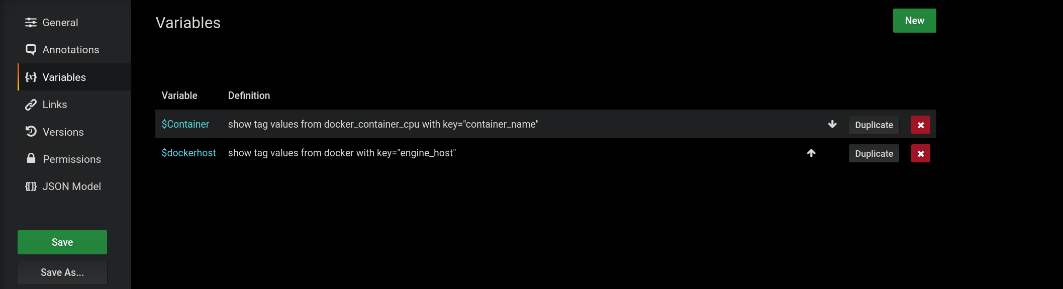
The top query will return a list of the current docker containers.
Crafting Queries⌗
Now we can start creating panels using this variable
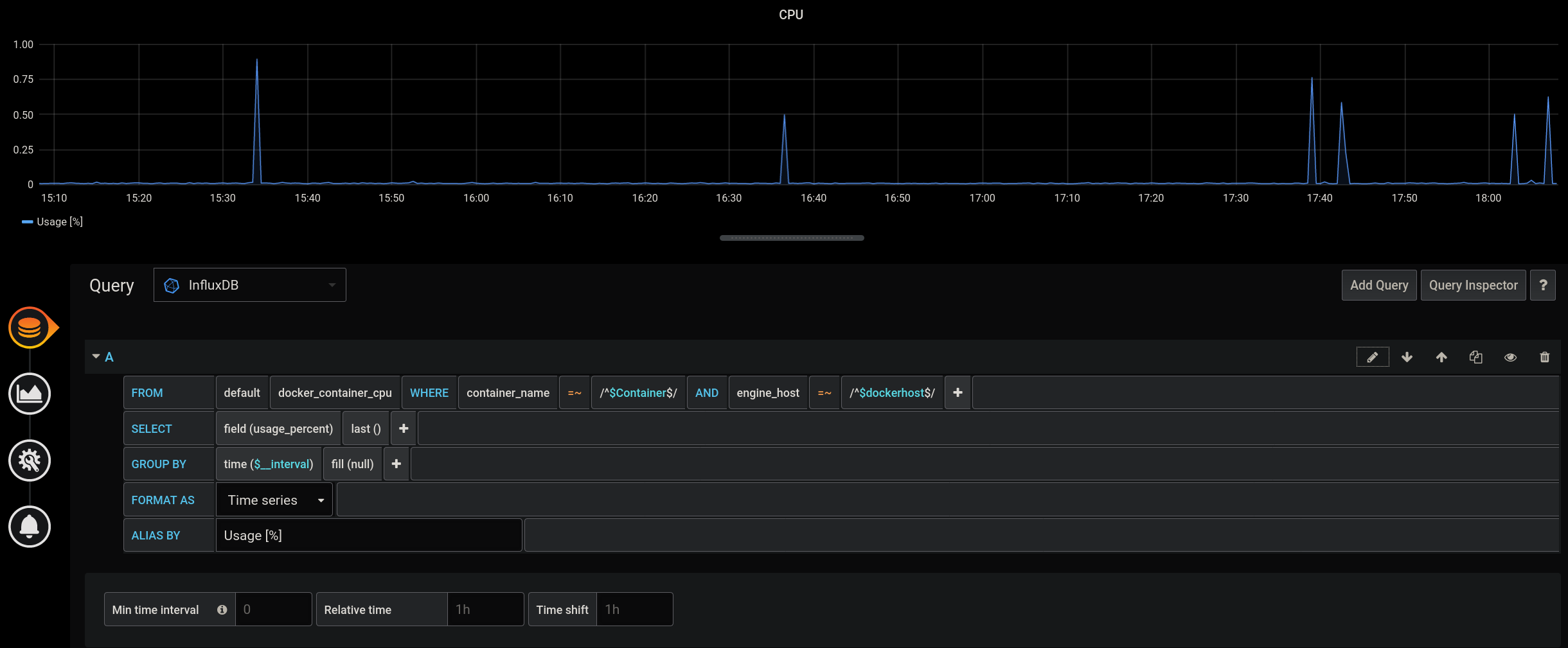
If we start creating more panels to show more stats about a container, we can put it in a row and duplicate it for every instance of the Container variable.
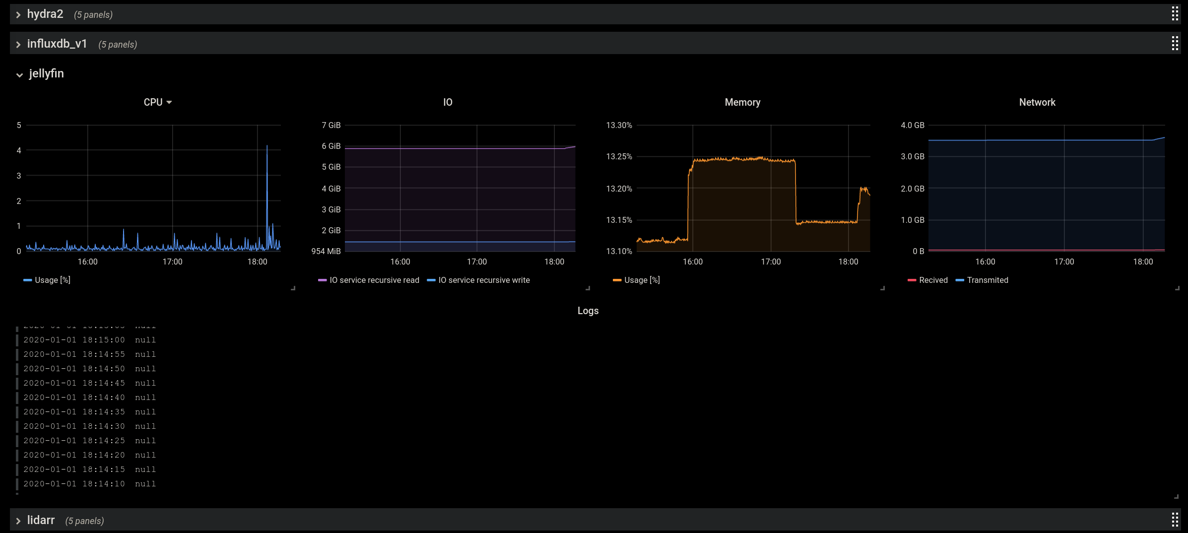
Jellyfin isn’t logging anything interesting at the moment, but all these metrics are helpful to have on hand if you are experiencing issues with any of your services.
System Metrics⌗
Much like monitoring docker containers, monitoring your actual hardware mostly involves clicking around the query constructor to see what fields are available in the database. I organized my system metrics dashboard in a sane way, with a variable for the host so I could reuse the same dashboard to monitor different hosts.
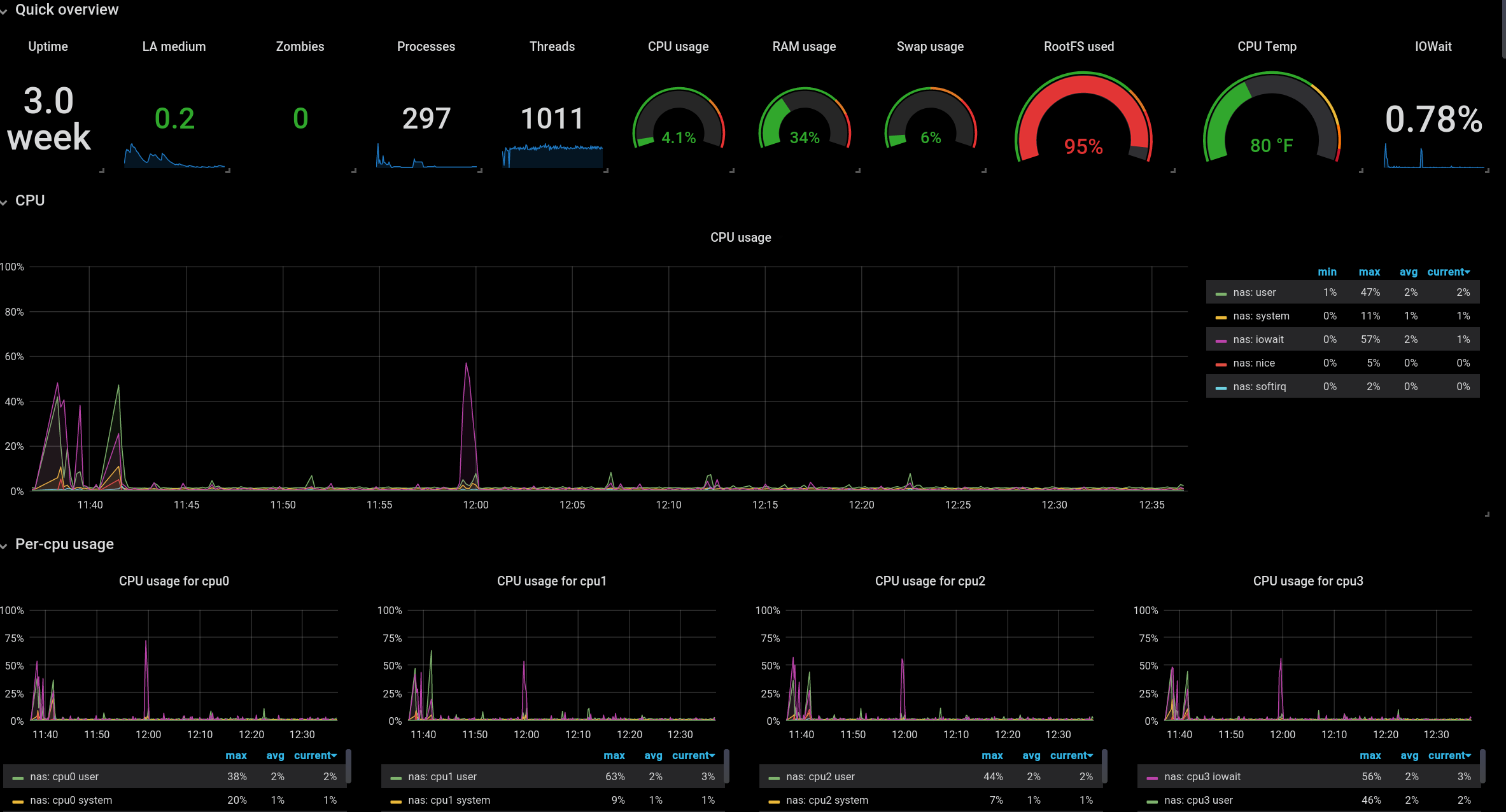
Make sure to check out the full list of Grafana plugins to see if there are any visualizations that make sense for your usecase. I love the singlestats and guages, which allow you to see the current status of a metric at a quick glance without worrying about temporal changes.
I also prefer a black background for most of my dashboards, with transparent panels on top. I guess that’s because I’m 1337. Or I don’t have better design ideas. Let’s just go
with the first one.
Flowcharts⌗
Speaking of third party plugins, allow me to introduce the flowcharting plugin. This plugin allows you to create
custom xml diagrams using draw.io, and link the xml elements to database queries.
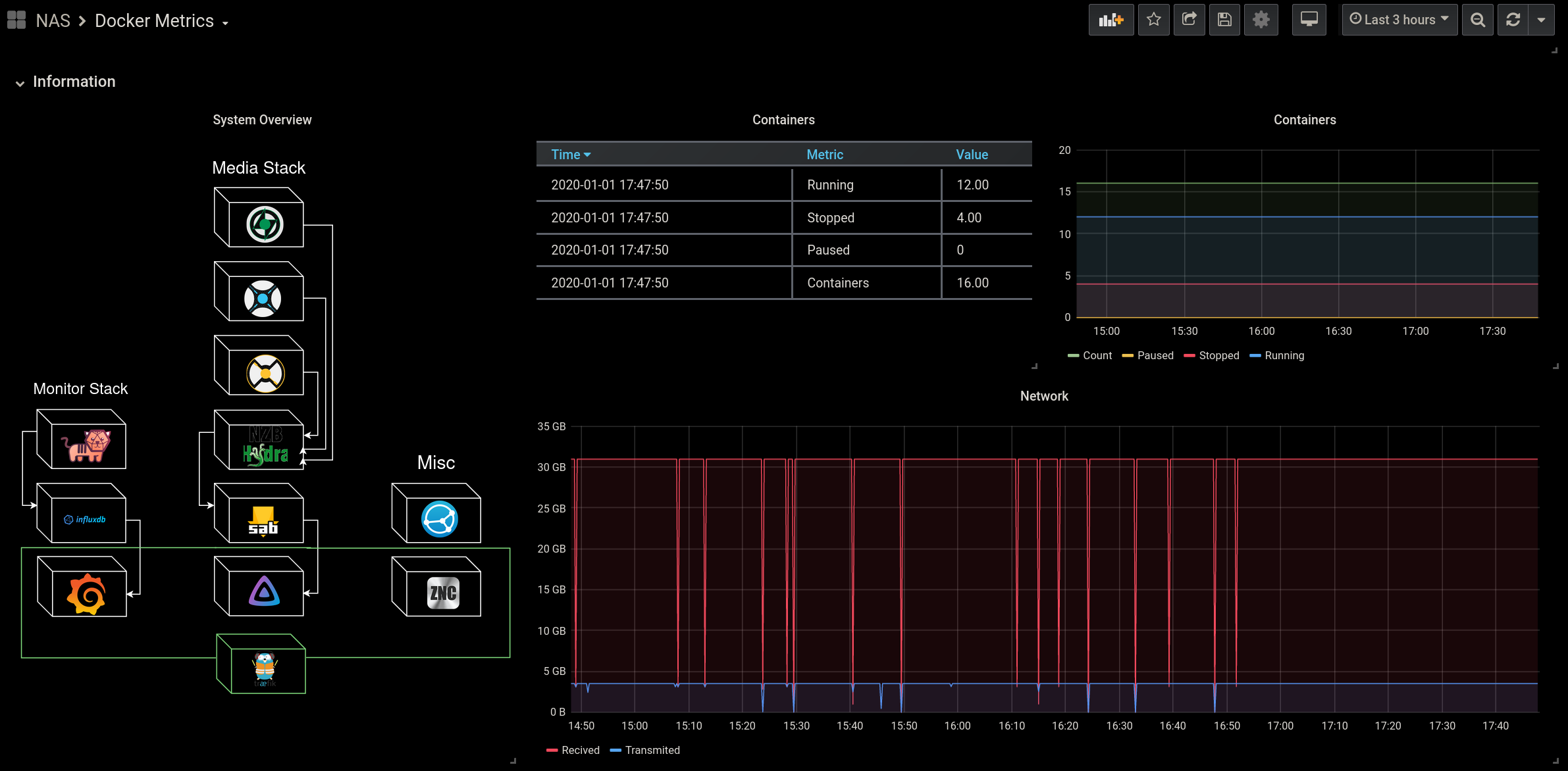
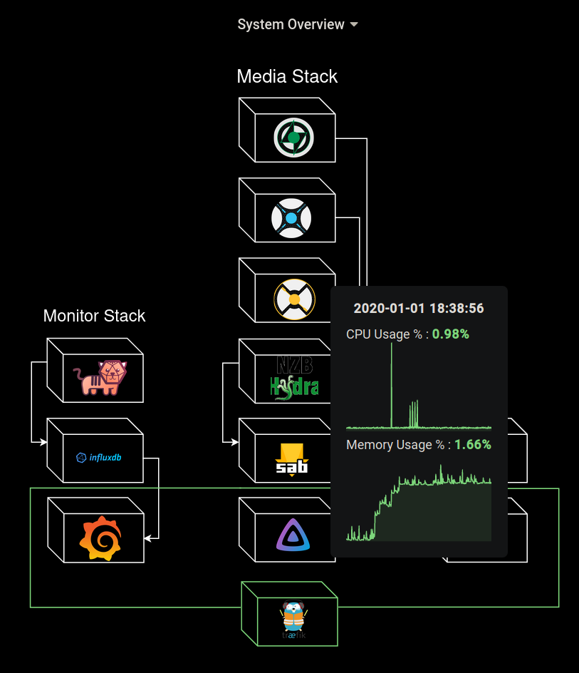
If all that sounded like nonsense, let me give you an example. Remember the cover of this article? That’s a neat little diagram of my current docker stack.

What if I told you this was more than a static diagram? By simply hovering my mouse over a container, I am presented with at-a-glance statistics about that container.
How does this work? Well it took me a bit of trial and error to get this working as it is a bit unintuitive at first. First, we have to create database queries for everything we want to measure. This is done from within the “Queries” menu of your new flowcharting panel.
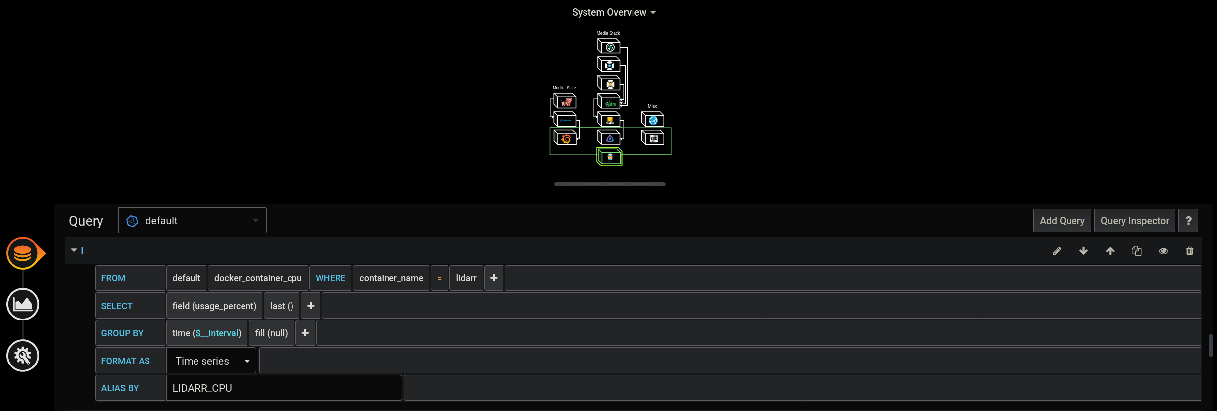
There could be a lot of queries. I was monitoring the CPU and memory usage of 12+ containers, so plugging in all the queries can get tedious.
Now we go back to the “Visualization” section of the panel. Here we can click the link to open draw.io and edit our XML diagram to your hearts content. Once you’ve done this, scroll down to the “rules” section.
Here we will need to create a new rule for every metric we want to monitor. In the example below, I am setting up a rule to monitor the CPU usage of Lidarr, like the query from the previous image.
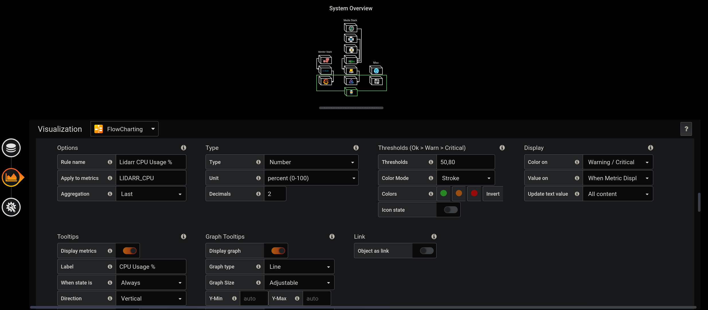
In the “Apply to metrics” field, we use the alias names of one of the queries we created in the previous menu. We set Aggregation to “Last” to collect the last stored value in our database.
Next we can set some value thresholds, which define acceptable levels for any particular metric. In this example, any CPU usage above 50% would be a warning level, but that
would change to critical if the CPU usage exceeded 80%.
On the lower half of the rule menu, we can enable the on-hover tooltip metrics, along with an optional graph. I like to have the graph colored to whatever state the rule is in. That way, I can have a visual representation of any issues in my system.
Not only can you hover over objects to get information, you can color the objects too!
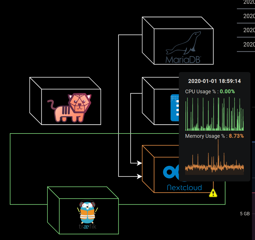
Here I changed the warning threshold to 1% to show you what it looks like if I was at a high level of memory usage. The box turned the warning color (whatever you define it to be) and flashes an icon (if enabled).
I set the Traefik container and the surrounding box to always display the state color, so I could always be sure my reverse proxy was functioning intentionally.
Other data sources⌗
Getting data from Telegraf is great, but InfluxDB and Grafana can do so much more. In the future when I can afford such luxuries, I intend to hook up all manors of metrics into Influx, so they can all be viewed within Grafana. The possibilities are truly endless. I could monitor everything from my stock portfolio to my smarthome (when I get around to setting that up).
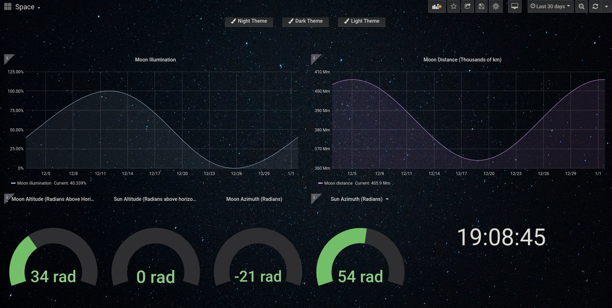
One interesting source is the “Sun and Moon” datasource. Here I’ve created a fun dashboard that covers most of the metrics available from that datasource.
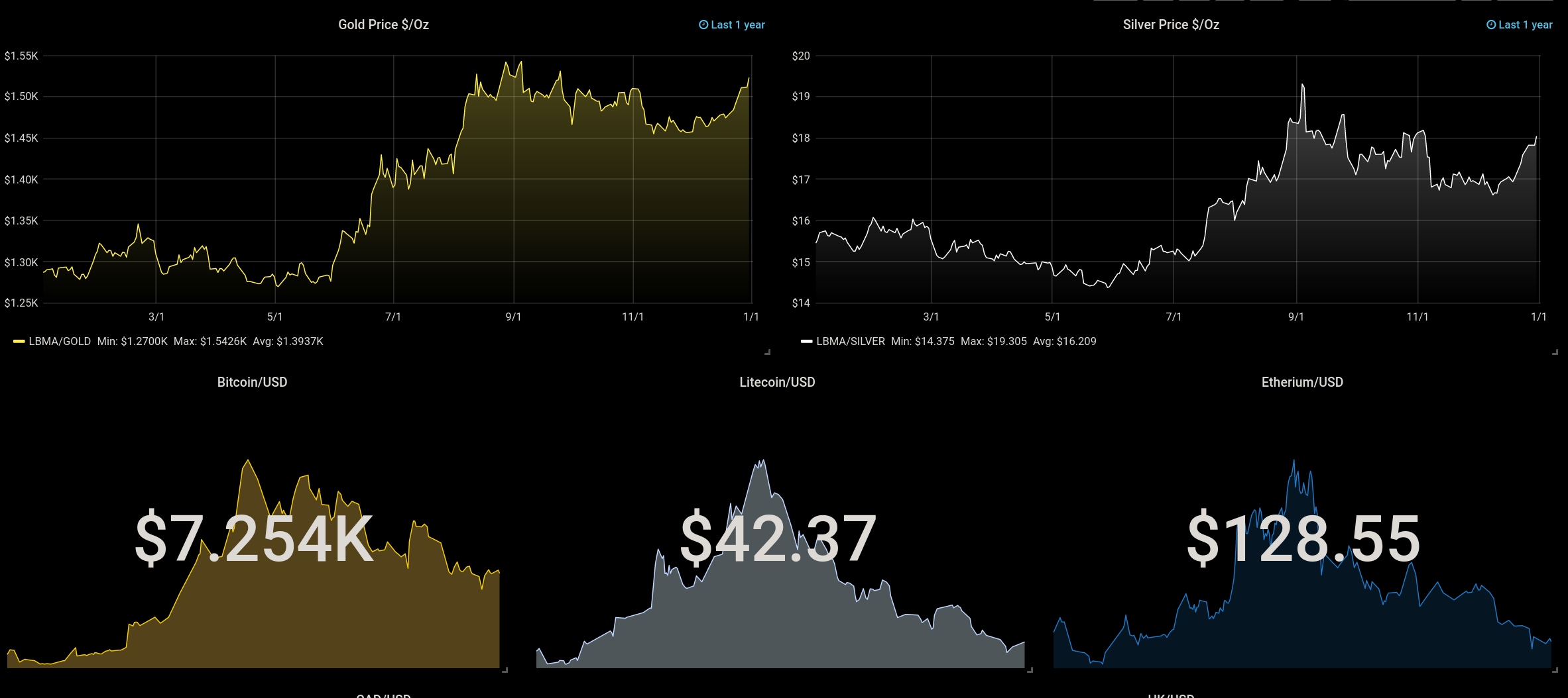
Here’s a snippet from an economics dashboard I threw together with the “Finance” datasource:
I really would like more documentation on the “Simple JSON” datasource, so we could use regular JSON endpoints as data and log it from there.
Conclusion⌗
In this post I showed you how to take your Grafana game to the next level and utilize some amazing plugins to make your TIG stack work for you.
With enough experimentation, you can get your TIG stack to monitor everything from your beer brewing operation to your home security system. I hope to explore some of these options in the near future!
Happy New Years! 😄